While fleet graphics can be a powerful tool for brand visibility, especially on the bustling roads of Wilkes-Barre, Pennsylvania, a poorly executed design can undermine your brand's message. Here are five common mistakes to steer clear of when designing your fleet graphics.
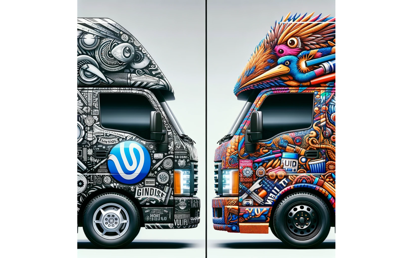
1. Overcomplicating the Design
While it's tempting to use intricate designs, remember that vehicles are on the move. Simple, bold graphics are more likely to make an impact and be remembered by those who see them.
2. Ignoring Vehicle Contours
Vehicles aren't flat canvases. Designing without considering the unique contours and features of each vehicle can result in warped or obscured graphics. Always tailor your design to the specific vehicle model.
3. Using Low-Quality Images
Pixilated or grainy images can make your fleet look unprofessional. Always use high-resolution images and ensure they remain clear when scaled up for large vehicle graphics.
4. Neglecting Brand Consistency
Your fleet graphics should align with your brand's colors, fonts, and overall aesthetic. Consistency ensures immediate brand recognition and builds trust with your audience.
5. Not Factoring in Maintenance
Fleet vehicles undergo wear and tear. Design graphics that are easy to patch or replace in sections without disrupting the overall look. Also, consider using high-quality wraps that resist fading and damage.
Conclusion
Fleet graphics are an investment in your brand's visibility, especially in places like Wilkes-Barre. By avoiding these common design mistakes, you can ensure that your fleet not only looks impressive but also effectively communicates your brand's message. At Wet Paint Printing and Design, we're here to guide you through the process and ensure your fleet graphics are a driving success.